Thoughts about Live Capture window (for faster live capture setupsetup)
-
Hello,
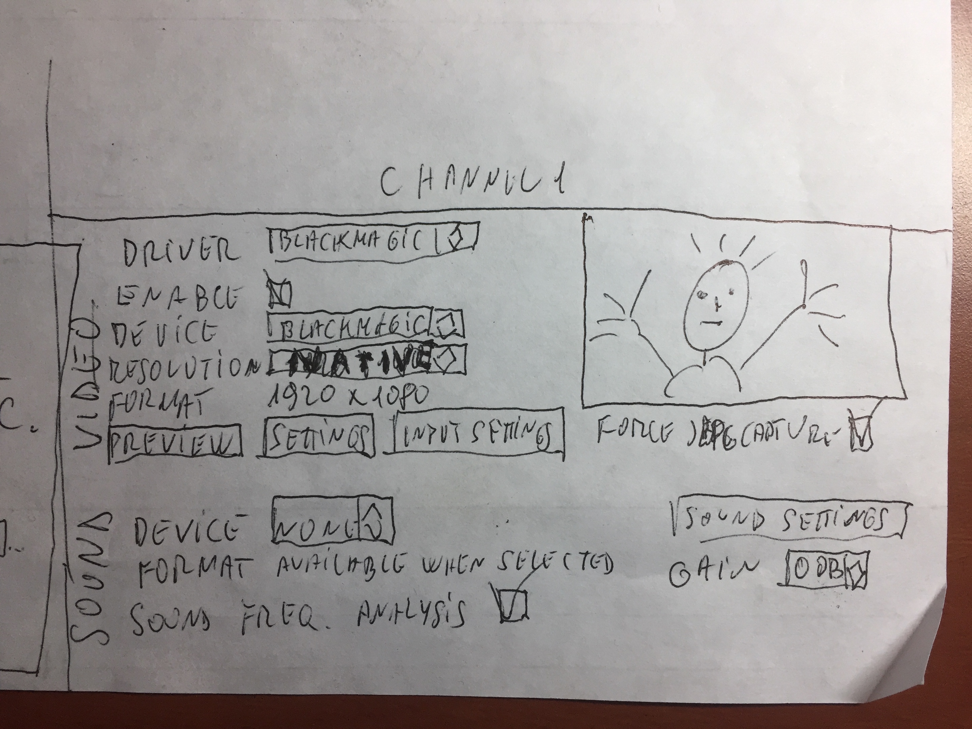
I had a thought about a visual lifting in Live Capture settings that probably won't be a hassle for Mark and makes faster management of its content I'd like to submit to collective wisdom. Actual window is done to be small and is contextual to channel switching. Although it is an elegant solution it might be confusing for a neophyte.As you all know the window is divided in 5 parts (1 buttons on top, 2 channel enabling and select, 3 video input, sound input and 4 channels audio video visualization). What I propose In a nutshell I think that each channel could have its video and sound menus. Much bigger window but more intuitive and many less clicks to do, more self explanatory.I made a hand drawing (an suck at drawing so don't take in account specificity of the layout). It is just a proof of concept :c lose to each image of each channel we could have menus for everything linked to that channel. Video and sound.Maybe much ado about nothing though. But I think it wouldn't take too much of Mark's time? -
I would be interested to see the drawing :)
-
PLEASE DONT LAUGH!!! I HAD GOOD INTENTIONS BUT DUNNO HOW TO DRAW
I've been drawing only channel one. Repeat 4 times ad leave the three buttons on top. (Start Live capture stop live capture and rescan) And voila.Ciao
-
The drawing is cute))
-
(sorry)
-
I like it. Maybe mock it up in photoshop? :)