Drop shadows?
-
Dear John,
Please give us your computer type (Mac/Windows/iPad/iPhone/Android/etc), and the type and version of your browser. We will have the programmer look into this.
Best Wishes,
Mark -
Here's the information you requested. This happens on my iMac only after clicking on the Exchange page. Safari browser is 10.0.3. Doesn’t happen on Firefox 50.0.2. OK on iPad 2.
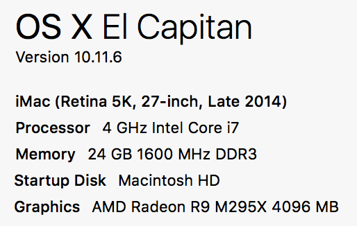
iMac: -
Opps, not used to the new forum... here's the computer info:

-
I have passed this on to the programmer who does the web programming. I am unsure if it is a general problem with NodeBB (the new forum software) or with some of the customizations he did. We're looking into it.
Best Wishes,
Mark -
Thanks Mark
I noticed today that, when I'm logged in, my iPad Air (latest iOS etc) shows the same shadows. And the text is very light grey.
John
-
Is anyone else seeing this?
Best,
Mark -
I don't see it on my Mac with Sierra and Safari nor on my iPhone 6s with iOS 10.2.1, the text looks fine.
But there is another problem, I can't really reply on my iPhone. When I hit reply I see the @nameOftheposter as normal but when I put the cursor into the text field and the keyboard appears I don't see @nameOftheposter anymore and also not where the cursor is placed. See attached images before and after placing cursor.
Best Michel
-
no, looks normal to me.
Is a non default theme being used?
-
I can't see this on any of my devices. Weird.
-
@DusX Yes, I was using "Slate" theme. It was the first setting I changed as I have a very hard time looking at the pink/magenta background. "Slate" didn't make any difference to that, but did affect the text. Default works as it should. Why have the choice if it doesn't work?
But thanks for figuring it out.
John
-
Well you have the choice for the embedded forum part but not for the website itself. The pink is not part of the embedded forum but of the website itself.
Best Michel
-
Well, there is the possibility for us to offer a different theme that does not include the pink background, but this requires a budget of both time and money. We're trying to maintain a single, unique "look" for the whole website, and the background is part of that story. If enough people feel strongly about this, we can try consider putting the time and money into developing an alternative theme.
Best Wishes,
Mark -
I can see the drop shadow now. On google chrome on windows 10.
-
See attached.

-
I've just spent a bit of time looking at the themes. I think 'Paper' is a nice all rounder and there seems to be no issues with it.