• Products
    • Isadora
    • Get It
    • ADD-ONS
    • IzzyCast
    • Get It
  • Forum
  • Help
  • Werkstatt
  • Newsletter
  • Impressum
  • Dsgvo
  • Press
  • Isadora
  • Get It
  • ADD-ONS
  • IzzyCast
  • Get It
  • Press
  • Dsgvo
  • Impressum

Navigation

    • Register
    • Login
    • Search
    • Categories
    • Recent
    • Popular
    • Tags

    [LOGGED] Feature Request: Initialize Indicator

    Feature Requests
    15
    23
    5302
    Loading More Posts
    • Oldest to Newest
    • Newest to Oldest
    • Most Votes
    Reply
    • Reply as topic
    Log in to reply
    This topic has been deleted. Only users with topic management privileges can see it.
    • Bill Cottman
      Bill Cottman last edited by

      nice idea!

      http://www.BillCottman.com : Isadora3.0.8f09 with MBP OS X 10.11.6 in Minneapolis, MN

      1 Reply Last reply Reply Quote 1
      • crystalhorizon
        crystalhorizon Beta Platinum last edited by

        Great idea!

        Alexander Nantschev | http://www.crystalhorizon.at | located in Vienna Austria

        1 Reply Last reply Reply Quote 1
        • Keve
          Keve last edited by

          I just wanted to post this feature request. 

          Glad somebody came up with the same idea earlier on! :–)

          I really miss this feature very much.

          Maybe tint the initialized value? 


          MBP 2016 | 2.7 GHz Intel Core i7 | Radeon Pro 460 4096 MB

          1 Reply Last reply Reply Quote 1
          • bonemap
            bonemap Izzy Guru @awilder last edited by bonemap

            @Keve  said:

            How about adding a visual indicator next to the parameter

            I agree, this is a great idea! 

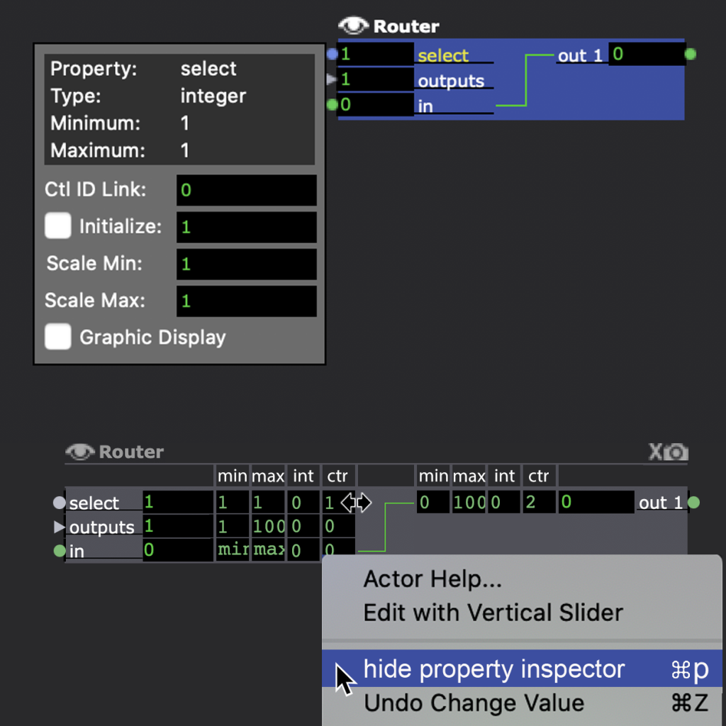
            There is the control ID number in the parameter setting window that places a visual indicator as an extension on the actors input, so a visual indicator of the initialize parameter would be helpful. I think it would also be helpful to think about redesigning the basic Isadora actor block or UI so that all of these parameter settings are visible all of the time and can be checked and manipulated directly on the actor or a persistent parameter panel. The parameters like 'Scale min' and 'Scale max' have such a significant impact on how an individual actor functions. I know it might be too much going on the face of it, and it would disrupt the current Ui/UX, but it is also a great design challenge to think about.

            best wishes

            bonemap

            http://bonemap.com | Australia
            Izzy STD 4.2 | USB 3.6 | + Beta
            MBP 16” 2019 2.4 GHz Intel i9 64GB AMD Radeon Pro 5500 8 GB 4TB SSD | 14.5 Sonoma
            Mac Studio 2023 M2 Ultra 128GB | OSX 15.3 Sequoia
            A range of deployable older Macs

            ? 1 Reply Last reply Reply Quote 1
            • ?
              A Former User @bonemap last edited by

              @bonemap+1

              1 Reply Last reply Reply Quote 1
              • mark
                mark @awilder last edited by mark

                @awilder said:

                How about adding a visual indicator next to the parameter if "initialize" is enabled?  It could be a very simple dot or checkmark just after the parameter name... anything that shows there's a hidden setting that's active.  I'm guessing this would be fairly easy to implement, and would save a TON of time in programming and troubleshooting. Thanks!

                @bonemap @deflost

                Does anyone have a clever idea on how to do this visually? Because it is an ongoing thing people also want is to be able to see if there is scaling going on. I have played around with bold and/or underlines for the param titles, different shapes for the port, etc. and nothing I have tried has been terribly satisfying visually. Either it's too subtle or a it makes a mess of the patch because it ends up cluttering things up too much. If you have an idea on how to make such thing visually clear without cluttering up the user interface too much, I'd love to see a drawing of what you think would do the trick.

                Best Wishes,
                Mark

                Media Artist & Creator of Isadora
                Macintosh SE-30, 32 Mb RAM, MacOS 7.6, Dual Floppy Drives

                Michel bonemap 3 Replies Last reply Reply Quote 0
                • Michel
                  Michel Izzy Guru @mark last edited by Michel

                  @mark

                  My idea: a ring around the port. White for initialize red for scaling and a mix of both.

                  Michel Weber | www.filmprojekt.ch | rMBP (2019) i9, 16gig, AMD 5500M 8 GB, OS X 10.15 | located in Winterthur Switzerland.

                  1 Reply Last reply Reply Quote 3
                  • bonemap
                    bonemap Izzy Guru @mark last edited by bonemap

                    @mark

                    @Michel is on to something. I assume you have tried the simplest and most obvious - marking parameter changes by color indicator of the text label and underline? I don't think that is too subtle personally. The flying labels might also work with a toggle to hide them

                    '

                    http://bonemap.com | Australia
                    Izzy STD 4.2 | USB 3.6 | + Beta
                    MBP 16” 2019 2.4 GHz Intel i9 64GB AMD Radeon Pro 5500 8 GB 4TB SSD | 14.5 Sonoma
                    Mac Studio 2023 M2 Ultra 128GB | OSX 15.3 Sequoia
                    A range of deployable older Macs

                    CitizenJoe Juriaan 2 Replies Last reply Reply Quote 3
                    • CitizenJoe
                      CitizenJoe last edited by

                      I was going to suggest changing the colour of the port, but I think that @bonemap's idea of the text is better. It might also work to change the colour of the black background? For me that's the most obvious and uncluttered.

                      Cheers,

                      Hugh

                      Hugh in Winnipeg - All test machines, Win10/11 Pro, 64 bit, OS SSD and separate data SSD.
                      Dell 7560, i9 11950H, 64 gigs, NVIDIA RTX A4000 w/8 GB GDDR6

                      Michel 1 Reply Last reply Reply Quote 0
                      • jfg
                        jfg last edited by

                        I find that the color change of the text (3 colors for scale, init and both) and the proposol of Michel are the best one. The others take too much place and won't work in all actors.

                        Jean-François

                        • Izzy 3.2.6
                        - MacBook Pro M1 Max 16" 64GB RAM, Mac OS 15.3.2 Sequoia
                        - Mac Pro 5.1 middle 2012 (3,33 GHz 6-Core Intel Xeon, 32GB RAM, Radeon RX 580 8 GB ),
                        Mac OS 10.14.6 (Mojave)
                        - Mac mini Pro M4, Mac OS 15.3.2 Sequoia

                        • A range of deployable older Macs
                          Located in Bremen, Germany
                        1 Reply Last reply Reply Quote 0
                        • CitizenJoe
                          CitizenJoe @bonemap last edited by

                          @bonemap Oh for goodness sakes, I only saw the bottom half of example, showing the text in colour!

                          Oops!

                          Hugh

                          Hugh in Winnipeg - All test machines, Win10/11 Pro, 64 bit, OS SSD and separate data SSD.
                          Dell 7560, i9 11950H, 64 gigs, NVIDIA RTX A4000 w/8 GB GDDR6

                          bonemap 1 Reply Last reply Reply Quote 0
                          • Michel
                            Michel Izzy Guru @CitizenJoe last edited by

                            @citizenjoe

                            changing the color of the port will interfere with the concept of the green dot if a port is mutable.

                            Best Michel

                            Michel Weber | www.filmprojekt.ch | rMBP (2019) i9, 16gig, AMD 5500M 8 GB, OS X 10.15 | located in Winterthur Switzerland.

                            1 Reply Last reply Reply Quote 0
                            • bonemap
                              bonemap Izzy Guru @mark last edited by bonemap

                              @mark, @michel, and all


                              I just wanted to see what it would be like.
                              I would probably appreciate seeing all of the scaling, initialize and control information like this with the option to toggle hide/show. The ‘int’ columns should be ‘ini’.
                              The defaults are also important to access - so it would not replace the pop-up default properties inspector .

                              http://bonemap.com | Australia
                              Izzy STD 4.2 | USB 3.6 | + Beta
                              MBP 16” 2019 2.4 GHz Intel i9 64GB AMD Radeon Pro 5500 8 GB 4TB SSD | 14.5 Sonoma
                              Mac Studio 2023 M2 Ultra 128GB | OSX 15.3 Sequoia
                              A range of deployable older Macs

                              Maximortal 1 Reply Last reply Reply Quote 0
                              • bonemap
                                bonemap Izzy Guru @CitizenJoe last edited by

                                @citizenjoe said:

                                Oh for goodness sakes

                                 You know design challenges take a bit of process. So don’t mind me visualising these alternatives. This challenge has been hanging around for a while and I don’t know if it is getting any closer to a solution.

                                Kind regards 

                                Russell

                                http://bonemap.com | Australia
                                Izzy STD 4.2 | USB 3.6 | + Beta
                                MBP 16” 2019 2.4 GHz Intel i9 64GB AMD Radeon Pro 5500 8 GB 4TB SSD | 14.5 Sonoma
                                Mac Studio 2023 M2 Ultra 128GB | OSX 15.3 Sequoia
                                A range of deployable older Macs

                                1 Reply Last reply Reply Quote 0
                                • mark
                                  mark last edited by

                                  Thanks for these suggestions everyone. I've got other tasks today, and probably won't be able to look this over carefully until later or first thing tomorrow. All ideas are welcome at this point if anyone else wants to make an attempt. Thanks @bonemap for the idea of showing it all. I guess that could be useful for a temporary examination, though for sure we wouldn't want that to be the norm. One thing to think about is mouse over: that simply pointing the mouse at something shows you the detail -- which you actually have now with the tooltips, but it could become something quicker to show and more detailed.

                                  Best Wishes,
                                  Mark

                                  Media Artist & Creator of Isadora
                                  Macintosh SE-30, 32 Mb RAM, MacOS 7.6, Dual Floppy Drives

                                  1 Reply Last reply Reply Quote 1
                                  • Juriaan
                                    Juriaan Tech Staff @bonemap last edited by

                                    @bonemap

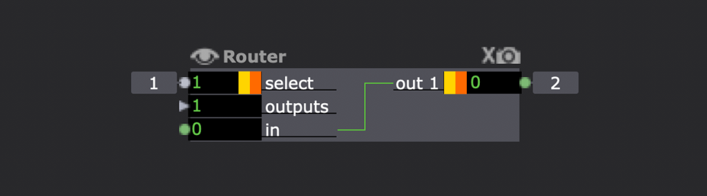
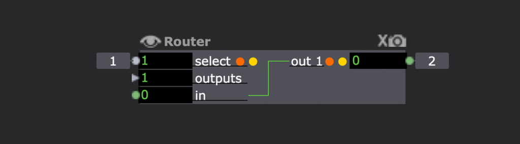
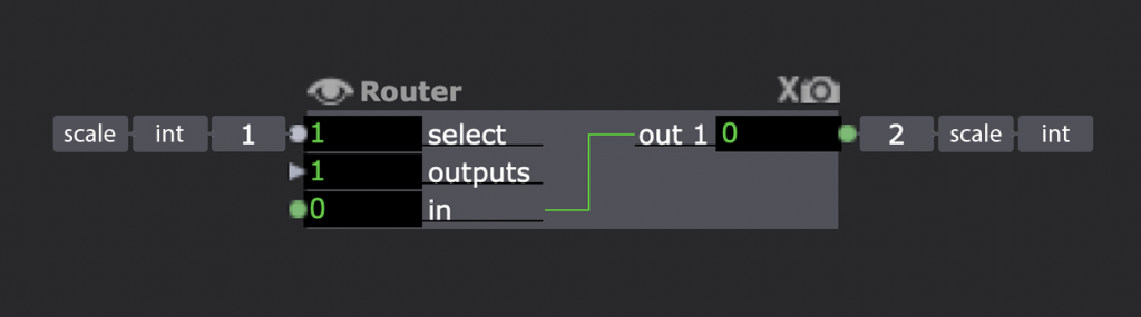
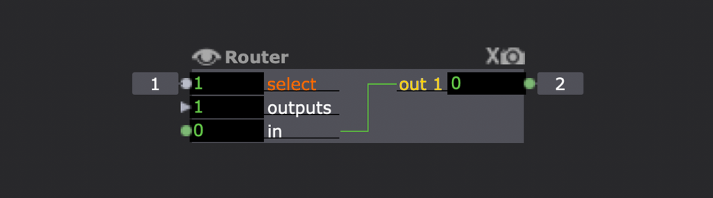
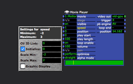
                                    I really like your third image, with a shortcut to toggle this is a really powerfull way to showcase what is going on with an actor without messing with userthemes / etc. I clearly see that it has a scale, it is mutated to a Int type and has a init value of 1. Clean, to the point and fits with the excisting UI. Dont know about the output side.. 


                                    @mark 

                                    I rather not have an mouseover to showcase this kind of criticial information when I working on a patch, I rather have a way to toggle a small UI and see some labels on my screen with each actor so I can quickly diagnose the problem and get on. Init values are mainly during 'crunch' times a pain and the shows that many of us are making are a bit to complex to go each single actor to see what is going on.

                                    Isadora 3.1.1, Dell XPS 17 9710, Windows 10
                                    Interactive Performance Designer, Freelance Artist, Scenographer, Lighting Designer, TroikaTronix Community moderator
                                    Always in for chatting about interaction in space / performance design. Drop me an email at hello@juriaan.me

                                    1 Reply Last reply Reply Quote 1
                                    • Maximortal
                                      Maximortal @bonemap last edited by

                                      @bonemap I think that adding boxes can be confising..lets image a 3d particles acotor with all that boxes...it became a grid of numbers. I tink that colors as suggested before can be better ( personally I like a lot the two colored dots )

                                      Iro Suraci | Win 10 - Ryzen 3600 - 32GB - nVidia gtx 960 4gb / Win 10 - i5 4210U - 8 GB - R5 M230 | Isadora 3.0.7| Located in Brescia, Italy

                                      bonemap 1 Reply Last reply Reply Quote 1
                                      • bonemap
                                        bonemap Izzy Guru @Maximortal last edited by

                                        @maximortal said:

                                        .it became a grid of numbers.

                                         Thanks for your feedback. You are right, on an actor like the 3D Particles or 3D Ropes there would be a lot of properties visible. It would be important to have the ability to show/hide all of those properties easily. Personally I would find it helpful to quickly see all of the property defaults  and calibrations. I often want to see what the default scale properties of one actor to compare to another. A scale might be -200, 200, but that is not going to be immediately obvious. Being able to toggle a view of all properties for two actors simultaneously would mean not having to use so many intermediary modules between key actors. For example, it would allow scaling interpretation of a patch in the properties rather than using so many Limit-Scale Value and Counter just so the logic of the patch remains visible. In that sense I see it could add efficiency nd simplicity. But, I agree you would not want to have every parameters property visible all of the time. This could be a simple hide/show toggle.

                                        It is just a thought process and interesting to consider.

                                        Best wishes

                                        Russell

                                        http://bonemap.com | Australia
                                        Izzy STD 4.2 | USB 3.6 | + Beta
                                        MBP 16” 2019 2.4 GHz Intel i9 64GB AMD Radeon Pro 5500 8 GB 4TB SSD | 14.5 Sonoma
                                        Mac Studio 2023 M2 Ultra 128GB | OSX 15.3 Sequoia
                                        A range of deployable older Macs

                                        1 Reply Last reply Reply Quote 0
                                        • dbini
                                          dbini last edited by

                                          I like Bonemap's double dots. i agree that a permanent display of scaling values would be too cluttered - they're only a mousclick away. also: i don't think we need anything extra to display the Control Link ID - its already there when its there.

                                          Just to throw a spanner amongst the pigeons: what if clicking the eye symbol opens up the opportunity to add MIN and MAX inputs around any existing input? (giving you the option of dynamic scaling without adding a Limit/Scale Value actor)

                                          John Collingswood
                                          taikabox.com
                                          2019 MBPT 2.6GHZ i7 OSX15.3.2 16GB
                                          plus an old iMac and assorted Mac Minis for installations

                                          dbini 1 Reply Last reply Reply Quote 1
                                          • dbini
                                            dbini @dbini last edited by

                                             - I just realised that if you had MIN and MAX as dynamic inputs, they would also need a MIN and MAX and INIT, etc, etc.... thus leading to an infinite rabbit hole of inputs - maybe its not such a good idea after all and we should just stick with Limit/Scale Value.

                                            John Collingswood
                                            taikabox.com
                                            2019 MBPT 2.6GHZ i7 OSX15.3.2 16GB
                                            plus an old iMac and assorted Mac Minis for installations

                                            1 Reply Last reply Reply Quote 0
                                            • First post
                                              Last post