[ANSWERED] Text Draw: Any Tips?
-
There's a lot of knowledge and discussion here on the forums about Text Draw, but I am looking to consolidate some wisdom from the TroikaTronix community on best practices when drawing text. As I prepare to deploy Isadora in a broadcast studio as an Alpha Titler, I am looking to gain more information on how to avoid stairstepping, aliasing, or generally blurry characters. Overall, when using Text Draw, the rendered output appears to be rather blurry, especially when the font sizes are smaller. This makes sense intuitively, as text rendering is a rather difficult task computationally, but in my situation, I am willing to burn many processor cycles on getting broadcast quality text rendering so the lower thirds I make in Isadora are ready for air, for example. I've tried creating the text at a very large font size and then zooming down with the Zoomer actor, experimenting with different fonts, stage sizes, scalers, Text/ure vs Text Draw, etc. I've yet to be able to get text on my lower third that would pass quality assurance, but I feel like I have seen artists incorporating text cleanly in the past. Any tips or tricks on rendering sharp text?
-
@liminal_andy said:
Any tips or tricks on rendering sharp text?
TL;DR: the rule of thumb is to the width of the Text Draw actor to match the width of your stage, and the height as small as possible to contain your text, you should get acceptable output. (I mean, I'm not a broadcaster, but it looks sharp to me.)
DETAILS:
The first and most important step is to set the resolution in the 'output width' and 'output height' inputs of the Text Draw actor. If you leave these set to 0, then Isadora uses the default resolution as set in the Isadora Preferences (Video > Video Image Processing > Default Resolution) which is set to 640 x 480 unless you modify it. Compare these images rendered to a 1920x1080 stage can captured by the Capture Stager To Picture Actor:
'output width' = 0, 'output height' = 0, which means the default resolution of 640 x 480 is used:

and this version where 'output width' = 1920, 'output height' = 1080

and this version where 'output width' = 3480, 'output height' = 2160

Cropping these so we can see more closely:
640 x 360

1920 x 1080

3840 x 2160

As you can see, there is a big difference between the 640x360 version and the 1920x1080 version. But since the stage size is 1920x1080, you don't gain much by doubling the resolution.
However, if we set the stage size to 3840 x 2140, then you will see a difference between the 1080p and 2140p outputs.
Resolution = 1920x1080, Stage Size = 3840x2160:

Resolution = 1920x1080, Stage Size = 3840x2160:

EFFICIENCY:
In this example, a huge portion of the 1920 x 1080 image is not used because you are only displaying a single line. So, you can improve efficiency somewhat by reducing the height while keeping the width the same.
Here's the output when for a 1920 x 1080 stage with 'output width' = 1920, 'output height' = 400. You'll see that it looks the same as when the height was 1080:

Best Wishes,
Mark -
@mark Thanks so much for the reply! I had been confused with the "output width" and "output height" labels because I thought those should constitute the portion of the screen that is being occupied by the text, versus the resolution of the output. Super helpful as always!
Some of the Office Hours crew will be doing a workshop on Isadora on Tuesday and they had asked me this question, so I will pass along the answer!
-
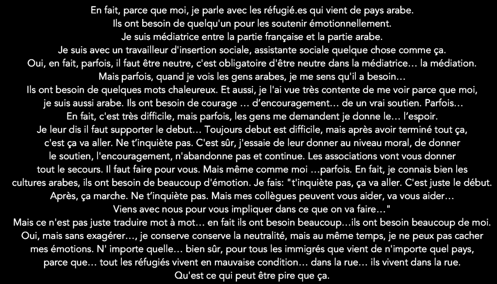
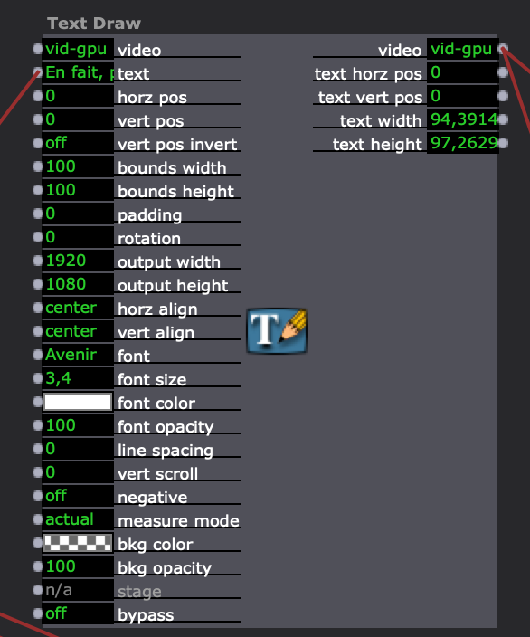
HI @mark and @liminal_andy sorry but I 'm outputting 1920X1080 and I still have bad resolution character, I'd like to change the font size but If I go upper thank 3,4pt I loose characters...
thanks
-
are you looking your text only in preview mode or in the fullscreen/projection mode? the preview mode is a reduced size
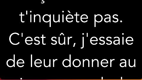
Preview
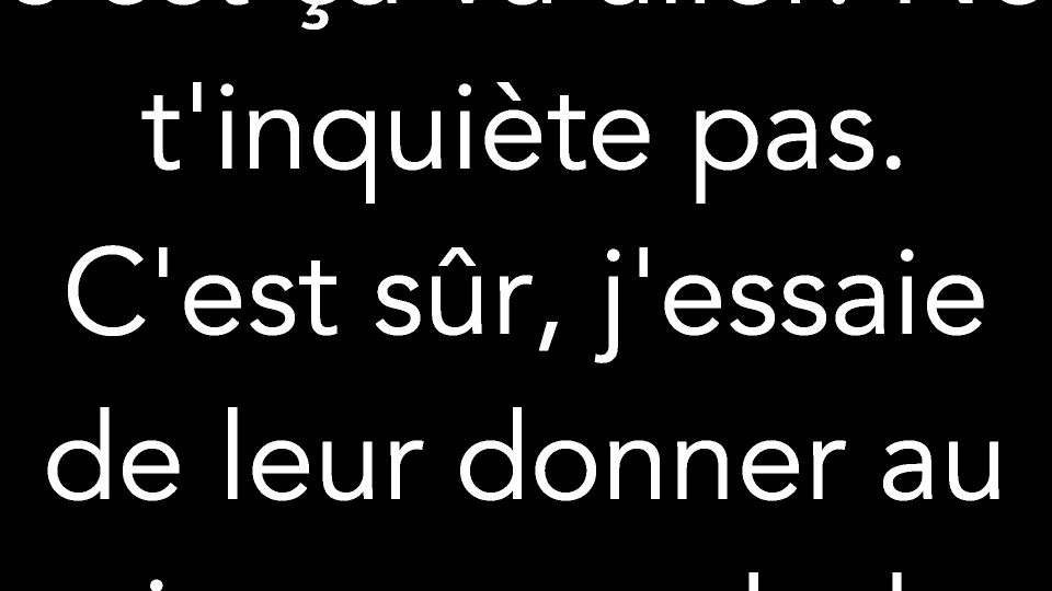
Full-size on second monitor

same with a text size of 200
I used your text with the same font "Avenir"
best
Jean-François
-
@jfg hi and thanks for your feedback,
I m outputting preview in 1920x1080 in the preview full size mode
I can’t put 200pt for character size cos after 3,5pt I loose some text …
-
I can’t put 200pt for character size cos after 3,5pt I loose some text …
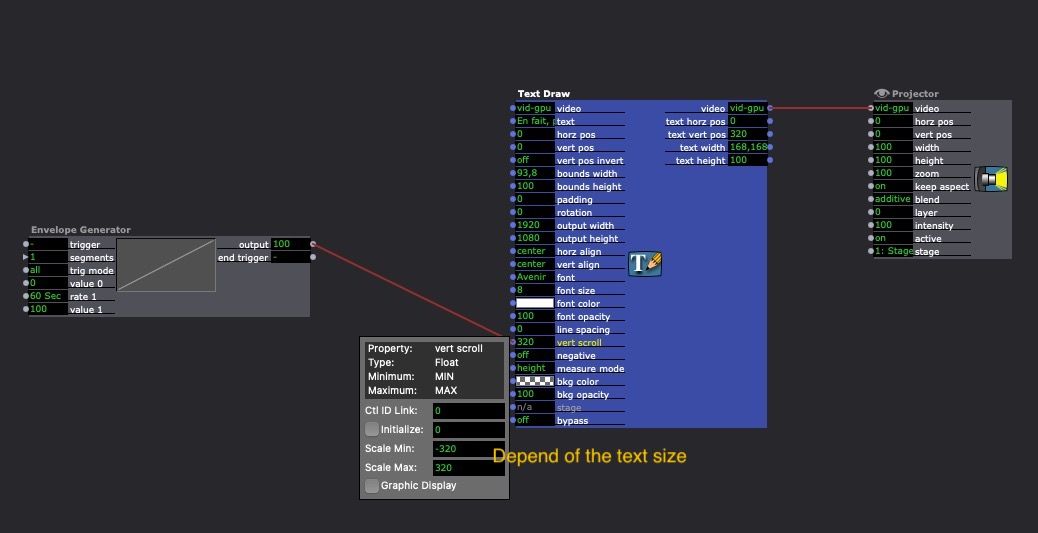
I am not sure I understand your problem. Your text is very long and if you want to show it bigger you have to split your text in several (depending of the size of the font) part and show every part one behind the other or to use the scroll function in the text draw actor. You can also use the "bounds width" input to set some space left on right of your text if you don't want the text touch the border of the screen.
or with several screens:
