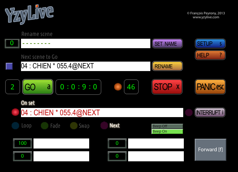
Controls, some questions
-
Hello everybody !
_Excuse my poor english, I'm french_I'm working for 2 years on a complex patch, basically a remote for Ableton's Live, in the context of Theatre.My purpose is to facilitate the use of Live during performances and rehearsals, and to add functionalities like, for example, automatically chain scenes, loop scenes, indicate countdowns, beeping when a Go is send, etc.I'm now working on the 'skin' of my patch, with the controls.1st, a naive question : I'm not a programmer, I don't know about C++, but do you think it possible to simply change the color of the "Number" control ?It is now green like on the antic displays, and for me it looks like lo-fi, vintage...2nd, i use some "buttons" with pictures attached. These pictures are png, divided in two parts, as explained on the manual.Currently there is about 30 buttons. And I noticed a very significant slowdown in the display.My questions are :- is it only dependent to my computer ?- is there precise rules to prevent such slowdown, like other graphic's format, rounded sizes ?3rd, in the Media windows, on the left corner, there is the 'Auto-adjust media numbers'. I really don't understand why is it muted as default.Because when it's muted, while importing a new image, everything is messed up...Thanks for help and advicesfypyAttached file : a screen capture of the work-in-progress
-
- There probably is a way - but like you I don't program and don't know C++ but in theory yes this is possible i'm sure.
2) PNG is one of the best files I believe so I don't think it's the file type (unless other can correct me?)3) If you load in 10 movies then each movie gets given a number (like an index number) if your then using all the movie in your patch and yo delete number 5, then 6,7,8,9,10 would move up the list and become 5,6,7,8,9 this then messes everything up like you said. Hope this helps.Like the design/concept by the way - keep me posted! I use Ableton Live a lot. -
Ok,I have found something :I have used a 'Background image", a black square, 4x4 pixels, with the Tile option(according to the manual : "IMPORTANT NOTE: If you choose the Tile option, it is very important that you use an image whose horizontal and vertical dimensions match one of the following values: 4, 8, 16, 32, 64, or 128.")I replaced this image by a black square, 128x128 pixels... and **the slowdown has ****disappeared** !!So, it is perhaps a good idea to use for "Background image" with the Tile option, an image as large as possible.Does that make sense to you ? -
Fypy. I don't know if as large as possible is good.. but rather these 8bit friendly dimensions are the important part as they tile quick and work well with memory and your video card.
I have been using rather complex control panels often, and the background tile has never seemed to slow them down (if using the 8bit sizes as you listed), but the png buttons can take a moment to load.. and do take additional memory (so you need to be sure you can spare it?) Isadora does have a memory access limit, I believe its 4GB. -
Thanks DusX my mistake : I meant to say as large as possible "considering the important note" ; so, 128x128. I have understood that the use of 8bits sizes is important, but I pointed the fact that mine was (a 4x4 square). And when i changed it to a 128x128, the problem dissapeared... I will check the size of my png files, thank you for pointing that fypy