[LOGGED] Feature Request: Initialize Indicator
-
I find that the color change of the text (3 colors for scale, init and both) and the proposol of Michel are the best one. The others take too much place and won't work in all actors.
Jean-François
-
@bonemap Oh for goodness sakes, I only saw the bottom half of example, showing the text in colour!
Oops!
Hugh
-
changing the color of the port will interfere with the concept of the green dot if a port is mutable.
Best Michel
-

I just wanted to see what it would be like.
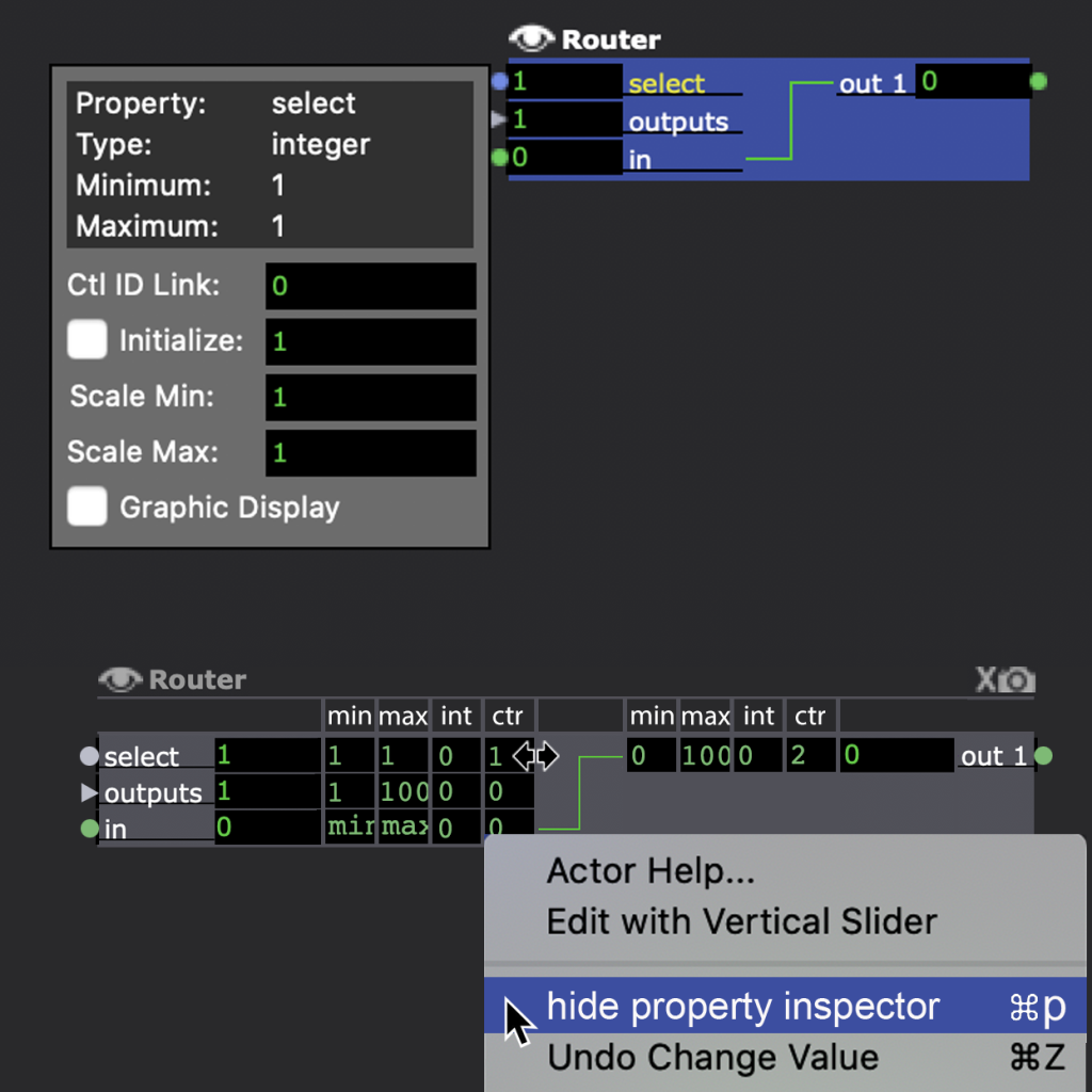
I would probably appreciate seeing all of the scaling, initialize and control information like this with the option to toggle hide/show. The ‘int’ columns should be ‘ini’.
The defaults are also important to access - so it would not replace the pop-up default properties inspector . -
@citizenjoe said:
Oh for goodness sakes
You know design challenges take a bit of process. So don’t mind me visualising these alternatives. This challenge has been hanging around for a while and I don’t know if it is getting any closer to a solution.
Kind regards
Russell
-
Thanks for these suggestions everyone. I've got other tasks today, and probably won't be able to look this over carefully until later or first thing tomorrow. All ideas are welcome at this point if anyone else wants to make an attempt. Thanks @bonemap for the idea of showing it all. I guess that could be useful for a temporary examination, though for sure we wouldn't want that to be the norm. One thing to think about is mouse over: that simply pointing the mouse at something shows you the detail -- which you actually have now with the tooltips, but it could become something quicker to show and more detailed.
Best Wishes,
Mark -
I really like your third image, with a shortcut to toggle this is a really powerfull way to showcase what is going on with an actor without messing with userthemes / etc. I clearly see that it has a scale, it is mutated to a Int type and has a init value of 1. Clean, to the point and fits with the excisting UI. Dont know about the output side..
I rather not have an mouseover to showcase this kind of criticial information when I working on a patch, I rather have a way to toggle a small UI and see some labels on my screen with each actor so I can quickly diagnose the problem and get on. Init values are mainly during 'crunch' times a pain and the shows that many of us are making are a bit to complex to go each single actor to see what is going on.
-
@bonemap I think that adding boxes can be confising..lets image a 3d particles acotor with all that boxes...it became a grid of numbers. I tink that colors as suggested before can be better ( personally I like a lot the two colored dots )
-
@maximortal said:
.it became a grid of numbers.
Thanks for your feedback. You are right, on an actor like the 3D Particles or 3D Ropes there would be a lot of properties visible. It would be important to have the ability to show/hide all of those properties easily. Personally I would find it helpful to quickly see all of the property defaults and calibrations. I often want to see what the default scale properties of one actor to compare to another. A scale might be -200, 200, but that is not going to be immediately obvious. Being able to toggle a view of all properties for two actors simultaneously would mean not having to use so many intermediary modules between key actors. For example, it would allow scaling interpretation of a patch in the properties rather than using so many Limit-Scale Value and Counter just so the logic of the patch remains visible. In that sense I see it could add efficiency nd simplicity. But, I agree you would not want to have every parameters property visible all of the time. This could be a simple hide/show toggle.
It is just a thought process and interesting to consider.
Best wishes
Russell
-
I like Bonemap's double dots. i agree that a permanent display of scaling values would be too cluttered - they're only a mousclick away. also: i don't think we need anything extra to display the Control Link ID - its already there when its there.
Just to throw a spanner amongst the pigeons: what if clicking the eye symbol opens up the opportunity to add MIN and MAX inputs around any existing input? (giving you the option of dynamic scaling without adding a Limit/Scale Value actor)
-
- I just realised that if you had MIN and MAX as dynamic inputs, they would also need a MIN and MAX and INIT, etc, etc.... thus leading to an infinite rabbit hole of inputs - maybe its not such a good idea after all and we should just stick with Limit/Scale Value.