Audio Features for Isadora: What Do You Want?
-
hello,
thank you for holding on while christmastime.
do you think it´s possible to route the "speak text" actor also on windows?
thx.
r.h.
-
@ mark look fantastic.
happy new year
Jean-François
-
@deflost said:
do you think it´s possible to route the "speak text" actor also on windows?
Well, I would have to find a way to intercept the samples and then route them. I doubt that this is easy, which means I cannot assign a high priority to this given that it is a feature that not so many people use. Let's keep it in mind for a future version.
Best Wishes,
Mark -
this would be great, because it´s one of the favorite actors by our kds workshops, they love it to let the machines speak!
thx.
r.h.
-
@deflost said:
this would be great, because it´s one of the favorite actors by our kds workshops, they love it to let the machines speak!
But do they really need to route to to a multichannel output?? Seems a bit sophisticated for kids.
Best Wishes,
Mark -
not really, but sometimes it is a little bit depressing that there is no way to do left right or front back things with it!
thx.
r.h.
-
@deflost said:
not really, but sometimes it is a little bit depressing that there is no way to do left right or front back things with it!
Sorry... I read "kds workshops" as "kids workshops" -- I thought they were workshops for children.
-
you read absolutly right, children. the most of them are around 8 to 12 or 16 to 20, we work a lot
with them in a cooperation with their schools.
we do every kind of "new media" stuff with them.
so in some situations, in special for theatre like performance stuff, they are very accurate
with things that have to be logic. so when they want to let the machine speak out come in,
then please from the right side, and when the bad witch calls from back outside the building, then of course they ask
why we don´t use bluetooth or something like that.........and so on.
but so they learn much about physical audio mixing consoles and this kind of stuff.
so another thx for your work.
r.h.
-
Dear All,
I hope you're enjoying your jump into 2020.
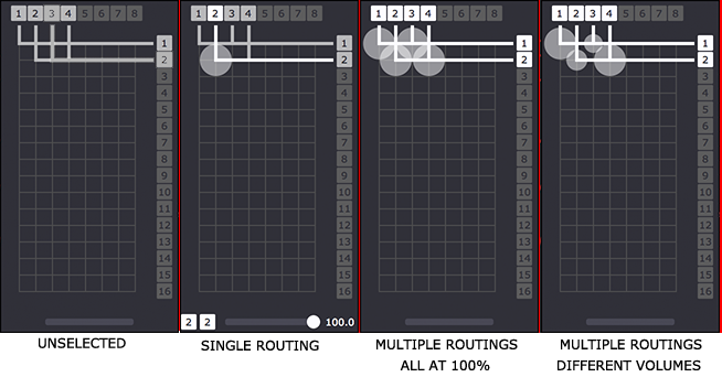
I'm exploring if and how the volume at the crosspoints of the Matrix Router should be displayed. On one hand, it's handy to see it and for sure when you are adjusting the volume, the circle getting biggger/smaller gives you strong visual feedback about which item you're editing. For sure, when no routings are selected the volume circles should not be shown. But maybe it gets too cluttered when you make a multiple selection? I could make it so that the volume circle only shows when there a single routing is selected.
I'd be curious to hear your reactions.

Also, as you can see, I've gotten this to be this to be bit more compact than you saw in the first GIF I shared before. But I can also anticipate that having more than 16 channels of output is going to make for a very tall user interface element... do people use more than 16 channel output devices on a regular basis?
Best Wishes,
Mark -
Hi Mark, Happy New Year!
Here's a thought: that the squares that are the numbers across the top grow into rectangles to indicate the volume level. They could even change colour, just like a VU meter!
Cheers,
Hugh
-
@citizenjoe said:
Here's a thought: that the squares that are the numbers across the top grow into rectangles to indicate the volume level. They could even change colour, just like a VU meter!
Thank you... intersting idea. The disadvantage being, if you are routing the same channel to many outputs, you wouldn't know the individual volumes for each output.
Best Wishes,
Mark -
-
@mark I prefere numerical values (dB) shown close to output number box, is more precise in professional enviroment where gain structure is foundamental.
-
@maximortal said:
I prefere numerical values (dB) shown close to output number box, is more precise in professional enviroment where gain structure is foundamental.
Well, I'm going to add an option for all volume values _everywher_ to be in dB -- so don't worry about that part for now.
But when you and @CitizenJoe say the numbers should be near the outputs, do you understand that that every routing has an individual volume control?
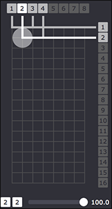
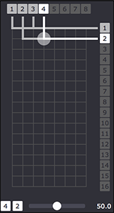
In left picture below, channel 2 is routed to output 2 with a volume of 100%. In the right picture, you see that channel 4 is also routed to output 2, but it's volume is 50%.


So, for a given output there can be multiple volume settings -- one for each source channel. How would you propose to indicate more than one volume setting at the output?
Best Wishes,
Mmark -
hello,
we talked a lot to our audio freaks. and they told us to prefer also numbers, because it is more compatible to the
audio world.
r.h
-
@deflost said:
to prefer also numbers
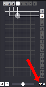
I'm not understanding your statement. The number is shown at the bottom when a single routing is selected, near the volume slider.
I am not trying to propose there are only circles to indicate volume; I am proposing those as additional visual feedback.
The precise value is always shown when a single routing is selected as shown in this picture.

Best Wishes,
Mark -
Dear Mark,
I find your proposal very good. It gives a direct idea of the volume and I think that to put the volume as a number at this place will overload the graphic and made it incomprehensible.
I can imagine (and I know) some sound installations with more then 16 ch but I think with 16 ch you will cover more than 90% of the needs.
happy new year 2020
Jean-François
-
@mark I think that the best options is to copy completely what other have done. I.e. RME total mix maybe just adding connections lines
-
@mark
Perhaps the volume slider, now located at the bottom, could be moved to the top, above the channel selection numbers.
The reason, is that for the majority of setups (8ch and less) the volume will be closer to the mouse, and highlighted routing.
It requires less movement to make adjustments, and is closer to where the user is already looking. -
@maximortal said:
@mark I think that the best options is to copy completely what other have done. I.e. RME total mix maybe just adding connections lines
What does that look like? Could you provide an screenshot and explain?